Launch trueluxuryvillas.com
Client True Luxury Villas
Agency Computer Rock
Brand Design, UX. UI Nora Grøtting
Launch breuninger.com
Client Breuninger
E-Commerce consultancy Talentformation
UX/UI/Digital Brand Design Nora Grøtting
METRO’s HoReCa food delivery service was recently rebuilt by software company freiheit.com technologies. From online ordering, to order processing, to "picking" orders in the warehouse with hand held-devices and truck loading, every process in the journey has been digitally transformed. Microservices now release automated live updates on a daily basis and the system is being rolled out internationally.
UX meets Agile
As the "UX/UI design team" on this project, John Grøtting and I worked in close collaboration with all vertical engineering teams, integrated into their agile development process. We communicated directly with international stakeholders at METRO.
Our responsibilities
included qualitative user research, the definition of overarching UX principles, interaction design, digital brand and UI design. While John worked with the teams building the back office and order processing systems, my focus was on the customer experience.
Lean UX
At the beginning of the project we collected insights and pain points through field research and interviews with our users: HoReCa customers and METRO employees. Throughout the project we conducted usability tests in Germany and France. We first used low fidelity prototypes (sketches, wireframes), then high fidelity prototypes (clickable and designed prototypes) and later the working software, depending on the development stage of the specific piece of software.
Key Insights & Solutions
HoReCa customers are constantly under time pressure, they order 2-3 times per week and usually know exactly what they need (key entry points = personal lists, search, previous orders, category browsing!). They often order while sitting in the restaurant off-hours (not at office desks), hence many still used fax order forms. Mobile devices make a lot of sense for them (mobile first!). Also, because they’d love to check inventory while ordering (offline mode!). Many HoReCa employees don’t speak/read the language of the country where they are working (requiring visual browsing, thumbnails in lists!). METRO employees on the other hand deal with many orders simultaneously and process massive amounts of information, at their desktop computers (expert users demand keyboard shortcuts).
Information architecture
Don’t organise chaos, eliminate chaos! We removed distraction that is not productive to the user flow. On every screen, we made certain data the center of focus. Together with the UX expert at METRO I created a concept for a global taxonomy master, which supports category specific faceted navigation. This is especially relevant in staple categories, like fish and meat (being able to filter by cut and origin), and strengthens METRO’s positioning as an expert partner.
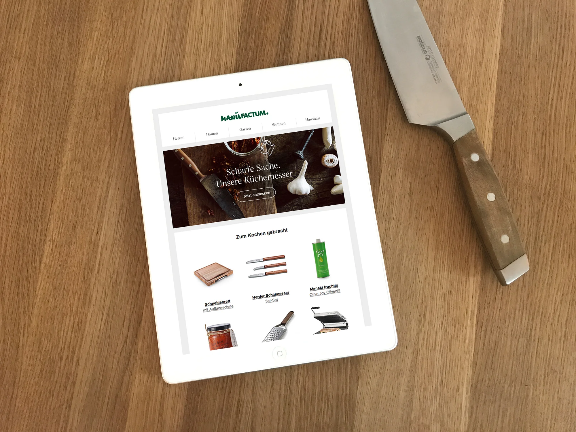
Responsive UI design
The best UI is no UI at all! Speedy interaction equals user satisfaction, so the UI should never get in the way. A lighter UI means focus on the core task or information. We pushed for for intuitive technologies (speech, gesture, touch) more AI instead of UI. Typing on smartphones is a hassle so search suggestions (while typing) ordered according to defined boosting/relevance criteria improve the experience dramatically. Internationalisation was a special challenge for the UI design. For example, different countries display different types and numbers of prices. The lengths of prices (and words) differ quite a bit depending on the language and the currency.
Digital brand design
"METRO exists to champion independent business", offering an attractive blend of price, quality, service and expertise, tailored to the business owners’ needs. METRO is also a place where the business owner feels welcomed and valued, fueled by ideas that make his business thrive. This brand promise was paramount in our UX decisions and also the basis of a new functional and friendly digital brand design I created. The new UI design with its typography, icons, colours, use of photography and components resulted in an effort to build a global pattern & style library, driving consistency for branding across channels and countries. On atomic level it is based on the newly introduced font combination Roboto/Noto, which supports numerous languages, has great legibility and a friendly aura. It comes preinstalled in many operating systems and is license-free, which is an important consideration for an international rollout. The colour palette was updated to fresh and friendly. I also put together a global master library for visual category browsing, and provided art direction in a photo shoot.
Next
While the MVP of this project focused on HoReCa clients, the next step is to bring these services to smaller B2B and B2C customers. Till Hinrichs and I created a concept and HiFi-prototype which integrates the efficient user experience built for HoReCa clients with the product features needed for a broader audience: various delivery options (e.g. Click & Collect), personalised promotions and relevant content.
I helped recruit Till Hinrichs and Maik Ploigt for this ongoing engagement. They currently make up the "UX/UI team" at freiheit.com technologies, together with Kristin Wichern.
Client Metro C&C
Software engineering freiheit.com technologies
UX/UI/Digital Brand Design Nora Grøtting
UX/UI John Grøtting
freiheit.com technologies builds software for the digital future. The German industry leader has been developing internet based software systems since 1999 and is known for innovative concepts, outstanding technical expertise, accuracy and reliability.
During several collaborative workshops with the CEOs, the employees, John Grøtting and myself, the company's positioning was uncovered and redefined.
I provided creative direction and design for the responsive website, its photography and two videos. Further, I coordinated our multi-disciplinary team consisting of film crew, motion designers, developers and photographer. This nimble team completed the project in less than two months, from initial strategy workshops to launch, including photo shoot and the production of the videos: "freiheit.com technologies" and "Ein Tag bei freiheit.com"
The result is an entirely new image for freiheit.com, which perfectly reflects the company's unique culture – German engineering meets a Silicon Valley can do attitude.
This attitude comes across in all kinds of event collateral I've applied the brand design to, from posters, banners, invitations to popcorn bags.
There was a recent website release 2.0. The storytelling was updated by Christian Riedel, and new photos are by Jochen Quast. The design was updated slightly (this was my role), but the brand design remained.
Visit the website freiheit.com
Concept/Storytelling 2.0 Christian Riedel
Text 1.0 Stefan Richter
Concept/UX 1.0 John Grøtting
Concept/Brand Design Nora Grøtting
Photography Ben Wolf
Film production 27km
Motion graphics Johannes Blümel
Illustration Tobias Wüstefeld
I had the pleasure of designing Caramelized's appearance at the Frankfurt Book Fair. As a newcomer in the market, Caramelized's goal was to establish themselves amongst publishers by showing innovation, quality and breadth – and to create awareness amongst consumers, grab passerby's' attention and to make people 'testdrive' the app.
A twelve meter wide photo-printed wall showed the entire Caramelized Collection with charming detail – and at the same time explained the app's features. The same design concept was applied to the brochures which also functioned as catalogues. iPads mounted onto a large wooden counter invited visitors to test the app.
Authors came by and had photos taken in front of their cookbooks featured on the Caramelized wall – which served as content for a little Facebook campaign.
CD, Text (en/de), Design Nora Grøtting
Exhibition consultant Andreas Dulz
Exhibition Contruction Isinger Merz
Printing Unitedprint.de
03.04.2014 – first day of spring break.
Airports are crowded, waiting at the gate is boring.
Travelers at the Hannover airport, however, are lucky. Tchibo ideas shows up and turns the waiting area into 'The fun begins here!'- parcour.
Kids and adults are challenged to test Tchibo's new line of summer games (pop-up soccer, slack line, giant bowling and many more).
The Tchibo games are then sent on vacation for further testing and fun. Along with photos, vacationers send in their feedback to Tchibo ideas. The campaign ends with a voting which ranks tested Tchibo games by their 'fun-factor'.
More about this campaign on tchibo-ideas.de
Agency Liquid Campaign
Client Tchibo ideas
Concept, Creative Direction Nora Grøtting
Director Wiebke Heygster
Production 27km
Little customers take center stage in this Tchibo ideas campaign: 'real' kids were invited to show and tell us what they like to play.
The kids' live actions combined with animations take us into imaginative wonderlands of adventurers and fairies – worlds which grown-ups usually never get to experience.
Tchibo is always on a quest for the special things that make life more beautiful and enjoyable, from exquisite coffee to innovative products and travel.
The plattform Tchibo ideas invites customers to become part of this quest – to participate in workshops, share ideas, design and test new products.
The campaign began with an application phase on Facebook and tchibo-ideas.de. The films were shown on Youtube and Facebook. They promoted a toy collection, just in time for Christmas. For more details visit Tchibo-ideas.de.
My role: idea, concept, creative direction.
Script and editing supervision in collaboration with Wiebke.
Agency Liquid Campaign
Client Tchibo ideas
Concept, Creative Direction Nora Grøtting
Producer, Director Wiebke Heygster
Motion graphics Johannes Blümel
Film Production 27km
Agency Liquid Campaign
Creative Direction Nora Grøtting
Photographer/Director Joerg Reichardt
Producer Marcella Maack
Post-Production 27km
Tchibo's line of rain wear undergoes real-life testing performed by customers. The campaign began with an application phase on Facebook and tchibo-ideas.de.
From numerous applications Tchibo selected the family that would be up for the ultimate weather challenge. Family Araujo was invited to Hamburg and spent the day in deep puddles, heavy winds and tropical rain showers.
The result were authentic films which promoted Tchibo's rain wear in a highly credible way. They were shown on Youtube, on Facebook and in Tchibo's Webshop.
The first film offers a behind-the scenes of family Araujo's experience, while the following are product specific and highlight product features.
More details about this campaign on Tchibo ideas.
The plattform Tchibo ideas regularly invites customers to become part of Tchibo's quest for the special things that make life more enjoyable. The community can participate in workshops, share ideas, test new products and be part of the design process.
Agency Liquid Campaign
Client Tchibo ideas
Idea, CD Nora Grøtting
Director Wiebke Heygster
Producer Marcella Maack
Film Production 27km
In November 2011 the agency Interone launched BMW Austria's new website with a multiple viewport architecture. It was the pilot for an international roll-out. As a freelance art director I designed several showrooms (3 Series Coupe, 7 Series Active Hybrid, X6, X6) – precise product presentation is set off by dynamic lifestyle photography.
In August 2011 Interone pitched the MINI website redesign. All creative efforts were developed to support the concept 'Like a friend'. The MINI has a character of its own, acts like a true best buddy. Til Hinrichs and I worked together on the concept and design of a new car configurator. With a toggle function integrated into the car specs box, it seemlessly integrates into the website's product pages. Functions available on every screen include live help, a 'uniqeness' indicator, a 'randomize' button, a 'change scene' button and a switch to a gesture contolled mode. A slider lets the user seemlessly change the speed of a 3D-driving sequence or zoom in or out of a scene. Little animations triggered in response to certain configurations and on demand film sequences (featuring your configuration) as well as 360-views are set in very MINI-typical settings. And beware, your best buddy will talk back!
Agency Interone
Le Mas de la Chapelle Saint Sixte is a Provençal farmhouse of exceptional authenticity with a series of vaulted rooms that encapsulate 850 years of history. It was rumoured to have been slept in by Pope Clement VI. Le Mas is located in Eygalières, a village nestled below the peaks of the Alpilles in a landscape of vineyards and olive groves.
When the owners were selling the property they decided to self publish a book that would portrait its distinguished character, its history and the beauty of the region. This linen bound book became a keepsake for the owners as well as sales tool and even brought Angelina Jolie and Brad Pitt to consider buying it (it, however, came with development limitations and code restrictions).
I provided art direction and designed the book, while coordinating the project working between the client in France, the writer in the US, the photographer in London, the printer, the calligrapher and the book binder in Germany.
Calligraphy by Peter Unbehauen
Photos: ©Sylvain Deleu
Moments I cherish captured with my iPhone.